参考ページ
tailwindcss.com
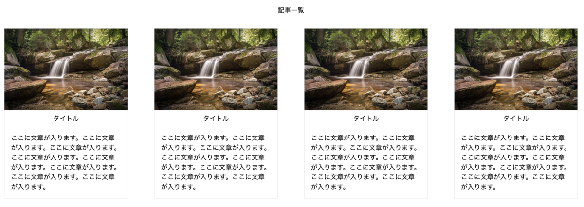
記事一覧を作ってみる
    <section class="mt-16">
        <h2 class="text-center mt-8 mb-8">記事一覧</h2>
        <div class="flex justify-center space-x-16 ml-4 mr-4">
            <div class="w-1/4 border">
                <img src="image1.jpg" class="w-96">
                <h3 class="p-2  text-center">タイトル</h3>
                <p class="p-4">ここに文章が入ります。ここに文章が入ります。ここに文章が入ります。ここに文章が入ります。ここに文章が入ります。ここに文章が入ります。ここに文章が入ります。ここに文章が入ります。</p>
            </div>
            <div class="w-1/4 border">
                <img src="image1.jpg" class="w-96">
                <h3 class="p-2  text-center">タイトル</h3>
                <p class="p-4">ここに文章が入ります。ここに文章が入ります。ここに文章が入ります。ここに文章が入ります。ここに文章が入ります。ここに文章が入ります。ここに文章が入ります。ここに文章が入ります。</p>
            </div>
            <div class="w-1/4 border">
                <img src="image1.jpg" class="w-96">
                <h3 class="p-2  text-center">タイトル</h3>
                <p class="p-4">ここに文章が入ります。ここに文章が入ります。ここに文章が入ります。ここに文章が入ります。ここに文章が入ります。ここに文章が入ります。ここに文章が入ります。ここに文章が入ります。</p>
            </div>
            <div class="w-1/4 border">
                <img src="image1.jpg" class="w-96">
                <h3 class="p-2  text-center">タイトル</h3>
                <p class="p-4">ここに文章が入ります。ここに文章が入ります。ここに文章が入ります。ここに文章が入ります。ここに文章が入ります。ここに文章が入ります。ここに文章が入ります。ここに文章が入ります。</p>
            </div>
        </div>
    </section>
結果
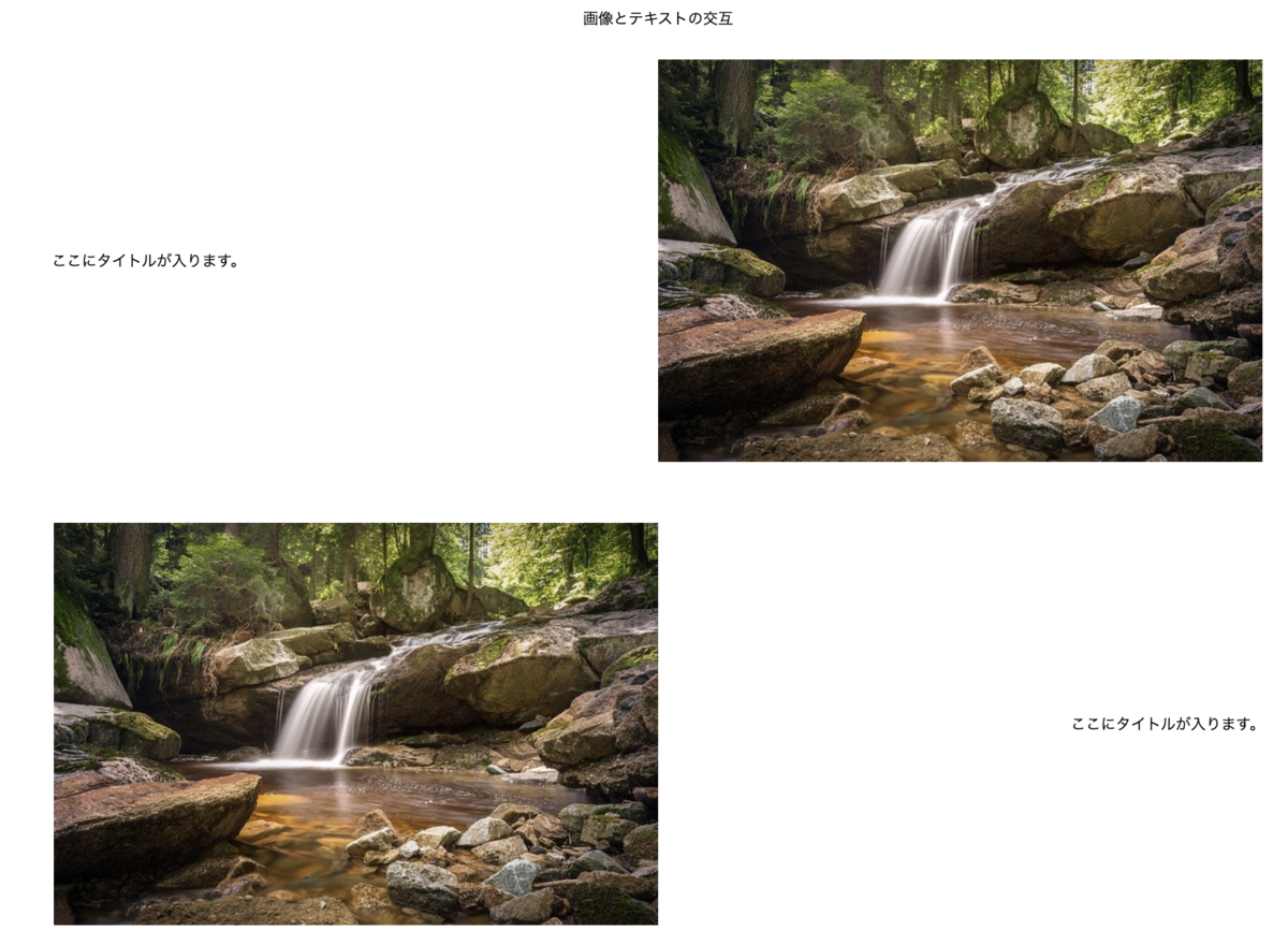
記事一覧を作ってみる
    <section>
        <h2 class="text-center mt-8 mb-8">画像とテキストの交互</h2>
        <div class="flex items-center">
            <div class="mb-16 p-16 w-1/2 text-center">ここにタイトルが入ります。</div>
            <img src="image1.jpg" class="mb-16 object-cover">
        </div>
        <div class="flex flex-row-reverse items-center">
            <div class="mb-16 p-16 w-1/2  text-center flex-row-reverse">ここにタイトルが入ります。</div>
            <img src="image1.jpg" class="mb-16 object-cover">
        </div>
    </section>
実行結果
flexboxでメニューを作ってみる
    <header class="flex justify-between">
        <h1>ロゴ</h1>
        <nav>
            <ul>
                <li>Home</li>
                <li>Infomation</li>
                <li>About</li>
                <li>Contact</li>
            </ul>
        </nav>
    </header>
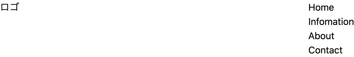
    <header class="flex justify-between">
        <h1>ロゴ</h1>
        <nav>
            <ul class="flex justify-end">
                <li>Home</li>
                <li>Infomation</li>
                <li>About</li>
                <li>Contact</li>
            </ul>
        </nav>
    </header>

    <header class="md:flex justify-between">
        <h1 class="pl-8">ロゴ</h1>
        <nav>
            <ul class="md:flex justify-end md:space-x-16 pr-8">
                <li>Home</li>
                <li>Infomation</li>
                <li>About</li>
                <li>Contact</li>
            </ul>
        </nav>
    </header>

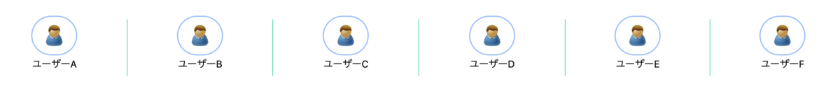
SNSぽっいメニュー
    <div class="mt-16 flex justify-around divide-x divide-green-400">
        <div class="flex-grow text-center">
                <img src="user.png" class="mx-auto w-16 rounded-full ring-2 py-2 px-4 ring-offset-4"/>
                <p class="py-2">ユーザーA</p>
        </div>
        <div class="flex-grow text-center">
            <img src="user.png" class="mx-auto w-16 rounded-full ring-2 py-2 px-4 ring-offset-4"/>
            <p class="py-2">ユーザーB</p>
        </div>
        <div class="flex-grow text-center">
            <img src="user.png" class="mx-auto w-16 rounded-full ring-2 py-2 px-4 ring-offset-4"/>
            <p class="py-2">ユーザーC</p>
        </div>
        <div class="flex-grow text-center">
            <img src="user.png" class="mx-auto w-16 rounded-full ring-2 py-2 px-4 ring-offset-4"/>
            <p class="py-2">ユーザーD</p>
        </div>
        <div class="flex-grow text-center">
            <img src="user.png" class="mx-auto w-16 rounded-full ring-2 py-2 px-4 ring-offset-4"/>
            <p class="py-2">ユーザーE</p>
        </div>
        <div class="flex-grow text-center">
            <img src="user.png" class="mx-auto w-16 rounded-full ring-2 py-2 px-4 ring-offset-4"/>
            <p class="py-2">ユーザーF</p>
        </div>
    </div>
実行結果